There is one painful truth about the process of writing research papers that I haven’t heard anyone talking about during my years as a PhD student: Figures keep changing until the very last moment!
It seems that the journey of figures (and other kinds of visualizations) in research papers is an ever-evolving narrative.
From the seed of a novel idea blooming on an initial whiteboard sketch, to the final (polished) figure that ends up published, there is a long and winding road of iterations, revisions, and adaptations.
I have personally experienced this phenomenon emerging in all of my research papers, and I’ve seen it happen to my colleagues as well.
In this article, I’ll make an attempt to demystify the process of crafting paper figures by using an example from Figure 2 of my recent paper.
I’ll give you insights on the transformations that this particular figure underwent throughout the research process before its publication.
Reading this article could help researchers to cope with the inevitable back and forward, and for non-academics to foresee the amount of work that goes into crafting each one of those beautiful figures that get finally stamped on papers.
Genesis: From the Whiteboard to the SVG file
Research projects often start with a burst of creativity during brainstorming sessions. According to my own experience, this involves sketching rudimentary boxes, arrows, and charts on whiteboards to delineate the goals and scope of the future paper. At these early stages, figures represent the first “big picture” of the ideas that will eventually turn into tools and experiments. While they serve as conceptual stepping stones, the initial figure rarely remains unchanged in the final publication.
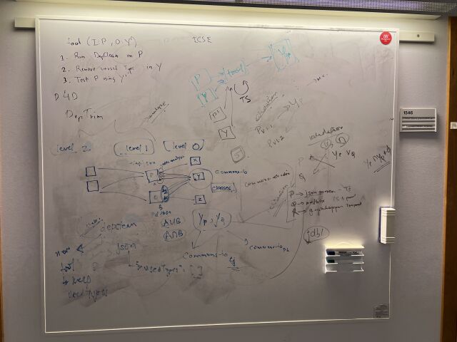
Q: Where should I start a research project?
A: In front of a whiteboard, of course!
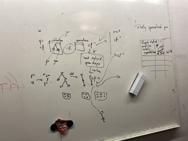
Figure 1 above shows the outcome of an initial brainstorming session on a whiteboard for one of my research papers. Although it may appear as a disorganized sketch at first glance, it effectively encapsulates the fundamental concept at the heart of the paper.
In general, there are some of the key elements to notice in the previous figure:
- In the top right corner, there is a function representing the input and output of the research tool that will be implemented.
- Below the function, there is an enumeration of steps that the research tool will perform in order to transform the input into the output.
- In the center of the figure, there is a representation of the data that the tool will use to perform the previous steps.
- In the bottom left corner, there are other existing tools that could be reused to perform some of the tasks.
- Finally, in the top center there is written “ICSE,” which is the name of the conference where the is expected to be submitted.
After the initial whiteboarding session, the next step is to translate the sketch into a digital format.
I use draw.io to create the first digital version of the figure.1
Whatever tool you use, make sure that the figure is saved in a vector format (e.g., SVG).
The first result is shown below.
Iteration: The Figure Evolves
After having a first SVG version of the figure, the next step is to iterate on it.
This is where the figure starts to take shape, along with research, which is a dynamic process.
Notice that as data is gathered and analyzed, the direction of the paper may change.
For example, new questions may emerge that were not apparent at the outset.
Thus, the figures must adapt to these evolving narratives.
An even more significant shift in figures often arises from the recalibration of the scope of the study. For example, after realizing that someone else has already done something similar, or that the initial idea is not feasible. This alteration could be as subtle as a change in axes or as profound as a complete redesign to encapsulate a new finding or a modified research question.
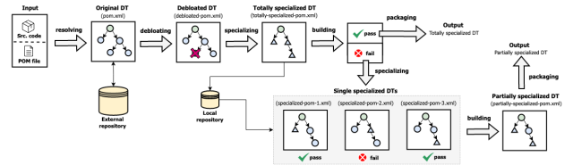
In the case of the figure above, the core idea remain was strong, but the initial version of the figure was too convoluted and didn’t convey the core contribution of the paper. Therefore, we went through a second round of whiteboard session (presented in Figure 3). From there, we realize that we could actually define three types of specialized dependency trees.
So I decided to add more information about the different steps (i.e., resolving dependencies, debloating, specializing, building) and the different types of dependency trees (e.g., totally specialized DT, single specialized DTs, partially specialized DT).
The result is shown in Figure 4 below.
Notice that as the project moves forward, the research questions also become more concrete. At the same time, I was implementing the prototype of the tool (i.e., DepTrim), and I realized that I could actually specialize the dependency trees in different ways. In addition, I also started to get preliminary data, offering the first actual glimpse of the study’s results. Consequently, the initial figures start to morph, accommodating this new data. These shifts in figures are largely attributable to the iterative nature of data analysis, as early results may not align with initial hypotheses or expectations.
Authoritative Feedback: The Crucible of Critique
At this stage, the figure seems awesome, right? Well, not so fast. So The next step is to get concrete feedback from a supervisor. Paper figures always need to be examined by people with a broader view of the subject, and often leads to another round of revisions. During this stage, the figure is meticulously evaluated by the research supervisor, an experienced authority in the field who assesses the research for validity, precision, and significance. An overly strong sense of ownership can often lead to confirmation bias concerning figures. To mitigate this effect, external feedback is a crucial part that provides a more balanced perspective. The supervisor may recommend adjustments to enhance clarity, better depict data, or provide a more truthful visual account.
Figure 5 below shows the feedback from my supervisor. In this case, he thought that the figure was too complex, and that it should be simplified.
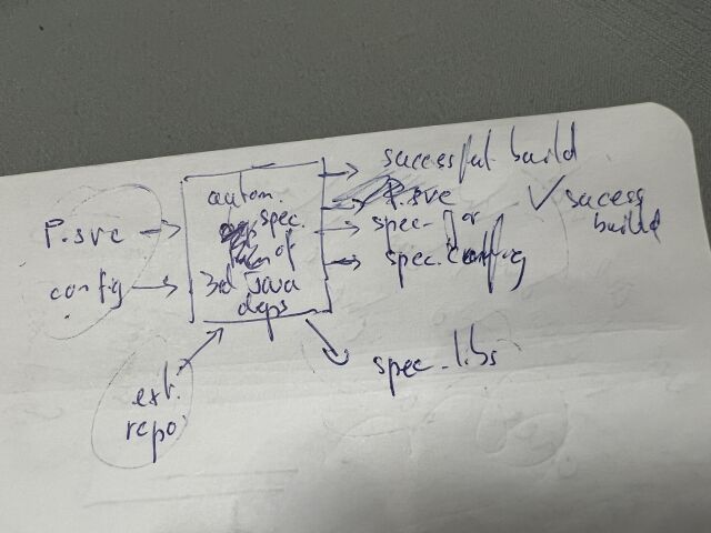
As you can see, the feedback can trigger modifications varying from minor tweaks to significant overhauls. Insights from the supervisory review frequently inspire researchers to reevaluate the presentation of their findings, culminating in significant alterations in figures. This procedure safeguards the accurate interpretation of data, ensures the figures genuinely mirror the data, and substantiates the reliability and replicability of the research conclusions.
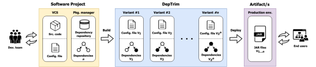
After the feedback, I went back to the editing software and tried to simplify the proposal. Figure 6 below shows the result of this simplification process.
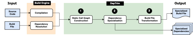
The three major changes to note are:
- I got rid of unnecessary elements in Figure 4 and focus on the conceptual transformation that the tool performs on the dependency tree. In other words, giving more relevance to showing the what instead of the how.
- The figure is now more focused on the core technical contribution of the paper. In this case, the research tool and its producing output.
- Having a clean horizontal layout is a good idea because it allows the reader to follow the three key actions executed by the tool, from left to right.
Refinement: The Final Touches
Once the figure is approved by the supervisor, the next step is to refine it. This is where the figure starts to take its final shape. The figure should succinctly communicate a single core idea, while maintaining enough complexity to effectively illustrate the intricate research process to execute the idea. In my case, I first noticed that the outputs were of different types (i.e., text files and binary files) and also that the compiled source code was also part of the output. So I decided to add this information to the figure (Figure 7).
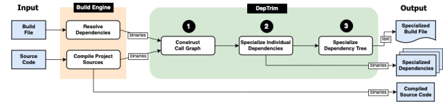
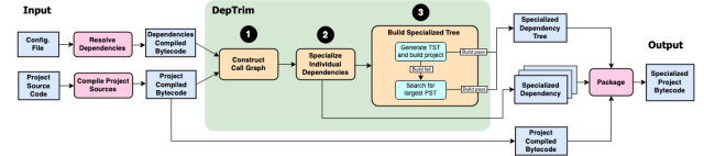
Looking good, right? Well, it can always be better. So I decided to add more details to the figure. Coming back to the different types of dependency trees, I realized is in step 3 (i.e., “Specialize Dependency Tree”) where I could actually show the different ways the trees could be specialized (Figure 8). Moreover, I realize that the “Build Engine” was not part of the contributions of the paper, so I decided to remove this concept from the figure.
This last iteration process is an example of striving to achieve the perfect balance between simplicity and complexity.
Here are the takeaways from the previous refinement process:
- Use “input” and “output,” obviously there could be multiple inputs, but it is better to have a single output.
- When presenting a tool, focus on the core technical contribution of the paper.
- Make sure to add those “small details” that make the figure more complete and accurate.
Conclusion
When performing “serious” scientific research, creating figures for a paper is like navigating through constantly changing tides. Just as the contours of unexplored oceans morph beneath a sailing ship, figures in a research paper often deviate from their initial conception. Far from being a nuisance, this malleability mirrors the fluidity and resilience of the scientific process. Imagine your figures as a choreographed dance of ideas and data, theory and observation, creativity and rigor. Visuals are worth a thousand words, they certainly make those words work for their time spent!
As a researcher, I had learned that the process of creating figures was a journey of discovery, a process of refinement, and a crucible of critique. This article, therefore, lifted the veil on this transformative process, demonstrating the relentless cycle of refinement that one of my figures underwent, and shedding light on the exhaustive effort that went into this creative endeavor. Whether you were a seasoned researcher or an intrigued non-academic, I hoped this exploration had given you a fresh perspective on the complex yet fascinating endeavors behind this fundamental task in the art of scientific research.